Tuesday, September 27, 2011

Polish your Photos Series: Quick Tips to Make them Shine


Hi, I am Becka (beckarahn) and I have been an Etsy seller since 2005. I am a fiber artist and technology geek. Through the years a lot has changed at Etsy, but having great photos of your work has always been the most important thing for a successful shop. The goal of this series is to show you some common photo problems and give you ideas of how to fix those flaws in just a few steps.


Quick Tip #3: Tiny Retouching
Here's another photo scenario that happens to me once in a while. I set everything up, I took a whole bunch of great shots, the light was good and what's that? There's dust and fuzz in my photo. How did I not see that?


Sure, it's not the end of the world, but it does make your photos look less than fabulous and it might turn off a potential buyer. It is pretty easy to remove a few tiny blemishes without having to re-shoot your photo. This tip should work for tiny problems like dust, stray threads, a wrinkle or flaw in your background.

In Photoshop, the tool you are looking for this time is called the "spot healing brush". It looks like a bandaid in the tool palette.


Your cursor will change to a tool that looks like an open circle. You can adjust the size of that "brush" with some options that will pop up at the top of the screen. Here's how mine is set (click the image to see it larger.)

Place the circle cursor over your dust spot and click. It will briefly darken that area and then it should make the dust spot disappear. You can also "paint" with the spot healing brush if you have something larger than a tiny spot (like a dog hair) by clicking and dragging it. Here's "before":

Here's the "after". Be sure to save this new corrected photo.
This tool is going to work best for tiny corrections. Remember, you don't want to spend 30 minutes working on your photo in Photoshop when it could be quicker to just shoot another photo.

(*The screen shots for this tutorial are from a Mac using Photoshop CS3. Other versions of Photoshop will have the same tool, but the menus might look slightly different.)

What if you don’t have Photoshop? Once again, look for a tool using your favorite software that is called "Spot Remover" or "Retouch" or "Blemish Fix". Here's what it looks like using Picnik:

Saturday, September 3, 2011

Titles & Tags & Relevancy, Oh My!

In my last article I talked about Etsy's new default Relevancy search and how it effects your shop, and specifically your titles. This follow up post is to clarify a few things and talk about Etsy's policy change on Tagging (since there still seems to be a lot of confusion on the subject).

To recap: Etsy changed it default search to "relevancy". The important points are that now titles carry more weight in searches than tags, and the beginning of the titles carry more weight in searches. So, your titles need to be accurate descriptive words, but the most important words (that tell us what your item is) need to be at the beginning of the title (first 2 to 3 words).

Etsy also now gives more weight in searches for exact 2 and 3 word combos - so using 2 and 3 word key word combos in your titles to describe your items are really critical to stand out in relevancy searches. But equally critical to relevancy is also using those same 2 and 3 word keywords combos in tags.

But that presented a problem, otherwise known as: Etsy's tag "stuffing" rule. If you've been around Etsy for any length of time you know it's not OK to tag "stuff". That's using multiple unrelated words like "beach ocean turquoise" in a single tag. Tags were supposed to be a single word, except for specific 2 word phrases like "sterling silver".

After some thought, Etsy decided to alter it's tagging policies to now allow for "relevant 2 or 3 word phrases" in tags because it is necessary for better relevancy. This now allows you to use the same 2 or 3 word keyword combos that you've used in your titles, also in your tags. You can read more about Etsy's policy change here: http://www.etsy.com/blog/en/2011/policy-update-labeling-items/

You still have to be careful that you are not tag "stuffing". It is still not OK to use "beach ocean turquoise" or "red blue green" as a tag, however you can use some 2 and 3 word phrases that would have previously not been acceptable under the old rules. Just be sure that your 2 or 3 word phrase makes sense in relation to the item you are tagging, and that it is actually a phrase (not unrelated words).

As an example, if you are selling a painting of an sunset on the ocean, and you have the words "Ocean Sunset" in the title, you can also have the words "Ocean Sunset" as a single tag in your tags. Previously "Ocean Sunset" would have not been allowed in a single tag.

Hopefully that helps to clarify some of the new changes, and you'll all be titling and tagging your way to the top of the relevancy searches.


Sandie Russo
Sellers Assisting Sellers Team, Captain

Friday, August 26, 2011

Polish your Photos Series: Quick Tips to Make them Shine


Hi, I am Becka (beckarahn) and I have been an Etsy seller since 2005. I am a fiber artist and technology geek. Through the years a lot has changed at Etsy, but having great photos of your work has always been the most important thing for a successful shop. The goal of this series is to show you some common photo problems and give you ideas of how to fix those flaws in just a few steps.


Quick Tip #2: White not Grey
I like to photograph my art against a white background. Sometimes when I don’t have enough light, that background turns out looking grey instead of a nice bright white, and leaves everything looking a little depressing.


The solution for this photo problem is very similar to how we corrected the “golden glow” in the last tutorial.

This time, open your image in Photoshop*, go to the “Image” menu, then choose “Adjustments”, then “Levels”. The “Levels” tool works great with photos that are under or over exposed. This sample photo (above) is under exposed and that is why those whites don’t look white.


Find the eyedropper that looks like it is full of white paint. Click on an area in your image that is supposed to be white. Try a couple of different areas on your photo to get the effect you like.


Be sure to save this new corrected photo.

This tip also works with photos that have black that doesn’t look black. This embroidery image below is over exposed so the background looks grey and not black. This time choose the Levels tool and pick the eyedropper that looks like it is full of black paint, then click an area of the photo that is supposed to be black.


(*The screen shots for this tutorial are from a Mac using Photoshop CS5. Other versions of Photoshop will have the same tool, but the menus might look slightly different.)

What if you don’t have Photoshop? Try looking for a “Brightness” or “Exposure” setting in your favorite photo software (ie Picnik, iPhoto, Picasa, Lightroom). That tool should have a similar effect.

Tuesday, August 9, 2011

Polish your Photos Series: Quick Tips to Make them Shine


Hi, I am Becka (beckarahn) and I have been an Etsy seller since 2005. I am a fiber artist and technology geek. Through the years a lot has changed at Etsy, but having great photos of your work has always been the most important thing for a successful shop. The goal of this series is to show you some common photo problems and give you ideas of how to fix those flaws in just a few steps.


Quick Tip #1: The Golden Glow
A common problem I see with photos is the “golden glow” caused by photographing under regular indoor incandescent lights. Although this is a nice sharp photo, you don’t get a real sense of the color of the pendant because everything in the photo is very yellow.


My favorite way to fix this “golden glow” is to use the Curves tool in Photoshop*. First, open your photo file and then go to the “Image” menu, then choose “Adjustments”, then “Curves”.


A dialog window will pop up. Look for the eyedropper icon that looks like it is full of white paint. (There will be a black and a grey one too.) Your cursor will change to an eyedropper.


Go over to your image and click in any white area of the background. By clicking, you are telling Photoshop: “This spot I just clicked is supposed to be pure white. Please readjust everything else in this image so that spot looks white.”


Try clicking a couple of different spots in your image until you get just the right adjustment. Now the white background looks white and the color of the pendant really pops. Once you are happy with your new image, then click “OK”, save your image and you are ready to post it in your shop.


(*The screen shots for this tutorial are from a Mac using Photoshop CS5. Other versions of Photoshop will have the same tool, but the menus might look slightly different.)


What if you don’t have Photoshop? Try looking for a “White Balance”, “Neutral Picker” or “Temperature” setting or an eyedropper icon in your favorite photo software (ie Picnik, iPhoto, Picasa, Lightroom). That tool should have a similar effect.

Stay tuned for more "Polish your Photos" tips to come.

Wednesday, August 3, 2011

Etsy's New Focus on Relevancy and How it Effects Your Shop

Hopefully you've already seen the info on changes Etsy rolled out last week, which will soon make "relevancy" the default search. However, if you haven't I'll give you the "411" and help you determine what you can do to make those changes work to your benefit in Etsy searches.

When searching on Etsy you have options to the narrow the searches. We are focusing on "relevancy" for this article, as it appears that more people are searching via relevancy - and soon it will be the default search.

❀ Item titles are now given more weight. Tags are important but your item title is even more critical. As titles are the most direct way for sellers to explain what they have, Etsy has given them more weight in Etsy searches. This means that it is critical that you have complete, accurate and descriptive titles for all the items you list. (Remember do not use the "name" you have given your art as a title, but describe what it is.)

GOOD title "Original Painting, Acrylic Seascape, Southern California Pacific Ocean Cliffs, Blue Green Turquoise, 11 x 17"
Not so good title: "The Calm Before The Storm, Seascape 11 x 17"

❀ Words that appear at the beginning of your title are given more weight. So, you will want to put the defining word/s of your item (sign, photo, bracelet, art print, oil painting, earrings, baby hat, coffee table, etc.) in the first 2-3 words. You will see better results if you put the most important characteristics of your item at the beginning of your title.

GOOD title: "Pearl Earrings, Sterling Silver Amethyst Beads, Extra Long Dangles, French Hooks"
Not so good title: "Elegant, Dressy, Fancy Handmade, Evening Style Pearl and Amethyst Earrings"

❀ Exact word pairs are now given more weight. If your search includes 2 or more words, Etsy will prioritize the search results that have those exact 2 words next to each other. For example, if I search for “California Seascape”, items that contain “California Seascape” (exactly) in the titles or tags will appear higher than ”Seascape Photo of a California Beach".

❀ Recency will also factor into searches sorted by relevancy. When a broad search (like “photo print”) returns a huge number of results, Etsy gives some priority to the most recently listed items in that search.
Before the Holidays take over our thoughts and shops, now is a great time to revamp your titles and make sure you use accurate descriptive words, putting the emphasis on the beginning of the title. If you do this - and someone is searching for items like what you make - you are more likely to show prominently in searches on Etsy.

Recent Etsy Blog Article on the Relevancy Search.
Etsy forum post from Frank/Etsy:  Relevancy Update

Have a great week, everyone!


Captain, Sellers Assisting Sellers Etsy Team

Thursday, June 23, 2011

Big News - Team Changes!

Hi Everyone!

I have some big new changes to announce.

Steph (PandaCub), who has been leading SAS since Anna (TheHouseofMouse) has stepped down as Captain, is in need of stepping down from the Captain's duties as well.  She will be staying on as a leader in the SAS Team Forum on Etsy, and I would like to take this opportunity to thank her for her all she has done for the team (and helping me with the transition)!

I have been Captain of the SASsy Critique Forum since Anna left, and enjoyed it tremendously!  So much so, that when Steph was looking for someone to take over for her, that I was happy to step up and take the job as Captain of the entire SAS Team (including the Critique Forum).  I look forward to assisting you all in your efforts to assist the sellers of the Etsy community.

If you have any ideas how we as a team and individuals can better serve the sellers of Etsy, please drop me a note, or post a thread in the SAS Team Mentors Forum. The easiest ways to reach me is by sending a message via either of my Etsy shops, KnitzyBlonde or ZaftigDelights, or you can email me at zaftig2k at yahoo dot com.  


I would love to see a resurgence of the team blog. It is such a valuable resource. Prior to this post, no one had posted since April.  I know that many of you have blogs and post regularly so anything that you have posted to your blogs that our readers would benefit from would be great to share here as well.  I'd also love any of you that enjoy writing to please send me your ideas for blog features.  They don't have to be long or involved.  Sometimes short and sweet is better!  But it would be great to hear from more of you.  I'd love stories about how you may have helped a seller with some specific ideas that can also help others.  If we publish you on the blog you always get a reference link to your Etsy shop as well, so it is a win/win!


I could also use more regular Mentors helping with critiques and questions in the SASsy Critique Forum.  I only have a handful of regular Mentors that help with critiques right now, and it would be nice to lighten their load a bit. Our Critique Forum is becoming a very busy place as we have received a lot of recognition lately (see next paragraph). If you could do one critique a day, or several a week, we would be thrilled to have you join us!  Let me know if you are interested.


Just yesterday there was a feature on me and our team on Handmade Spark!  I hope you'll stop by and check it out.  

I look forward to getting to know you all better!


SAS Captain

Saturday, April 2, 2011

Mini Critique: Sections that Sell

Hey everyone! Meagan here. I have an important announcement for you all. First off, I hope you all are doing well, & learning a lot from these mini critiques. I have really enjoyed doing them. Now, just for the record, today will be the last mini critique I'll be posting on a regular basis. Yep it's true! We've covered a lot of the basics on shop set up & I think we're at a good stopping point. Sooo, if you have a question about something. You can always convo me on Etsy @Baby Swank & I'll be glad to direct you to some great info & give you my advice or you can email me at meagan {at} meaganvisser {dot} com too.


So, onto today's critique...Sections that Sell.


As some of you may know, I have a blog series running on my blog right now called ReVAMPing Your Etsy Shop - 2011 & it's a lot like these mini critiques. It's a ton of shop how-to & advice from several different Etsy sellers.


Now this weeks blog post was on Shop Sections, Rearranging Your Shop, & Featured Listings & it was written by the lovely Kimberly of Cinnamon Spice on Etsy. So I'm going to let you in on a bit of her advice today...{that is if you haven't already read it on my blog ;P}. So the following is the excerpt from this weeks post - all about different ways to use your sections. Then following that I'm gonna show you 3 shops that I think are using their sections well! So here we go...


From ReVAMPing Your Etsy Shop - 2011 Blog Series via MeaganVisser.com


Let’s face it, we’ve all been to the “discount” brick and mortar stores that are a jumbled mess, and while sometimes I do enjoy unearthing that incredible buy, I much rather prefer to shop in stores where merchandise is well organized.  Your Etsy shop is no different.  The key is finding which style works for you and your potential customers.  The best part is you can experiment until you’re happy with the results!

Shop Sections

Use Shop Sections to categorize your items. Some effective styles are to:
Organize by Theme – For Cardmakers and shops that cater to party planning and decorating, a great way to organize your shop is by theme. Most of your shoppers will probably be looking to buy for a special occasion such as birthday, anniversary or holiday.  Tailoring your sections according to theme, like inkylivie does should help guide them directly to what they need!
Organize by Size – Most shoppers really appreciate being able to hone in on the exact size they are looking for whether they are buying jewelry, apparel, handbags or shoes.  Save your customers time by using the sections to group your items by clothing size or even small, medium and large works well or non-apparel items.  Cite fuzz labels her hats by size for quick reference.
Organize by Type of Item – Paper crafters like myself can benefit from organizing their stores by type of item.  When shoppers visit my store they can instantly see what type of paper crafts I specialize in, whether it’s an Altered Journal, my “Get Scrappy Kits”, a Greeting Card or a Mini-Scrapbook Album.  This style also works for hair accessory makers and those with a variety of different items for sale.  Lil’ Princess Bow and Mary had a Little Party have their shops wonderfully organized by type.
Organize by Price – Bath and body sellers, or other sellers that make use of gift baskets or groupings, can get a lot of mileage from using their shop sections to organize by basket and price.
Organize by Color-  If you make similar items in several different colors, you may help your visitors narrow their search by grouping like colors together.
Now, have fun orgzanizing your Shop sections!  Create and/or edit your sections in Your Etsy > Shop Settings > Info & Appearance (there is a tab for Sections).
Okay, now if you want the rest, you know where to go. Right here. So now I'm gonna show you 3 shops on Etsy that I think are following Kimberly's advice & using there sections well!
So as you can see Knarken sells jewelry & she's using her shop sections to direct customers to specific types of items.


Okay, in Dolly Rocker Candles you can see that products are listed by scent and type. Awesome!
And lastly, Miss Merryweather's Creations lists her very cute card by Theme.
Alright! Now go check your shop out, see if your sections are directing customers & making it easier on them to shop. If not, see if you can make them work using any of the above suggestions from Kimberly.

Once you're finished, leave your shop link in the comments below so we can check out your improvements!!

Don't forget to connect with me on Facebook & Twitter!

Saturday, March 26, 2011

Mini Critique: Pricing your Products

So this week, Kara of The Felted Posey has agreed to let me critique her shop. She had several things she had questions on so I just picked one I hadn't covered yet & went with it.

The Felted Posey on Etsy
So today, we'll be tackling Pricing!

Okay, this is going to be a quickie!

There's no need to take a look at The Felted Posey's shop prices or for me to critique them. This goes for any shop other than my own as well. Why? Because I have no clue about what goes in to making the products you offer in your shop. Only you do. That means that today's critique is going to be a self-critique for you to do on your own shop.

Now you need to be thinking about the following things when it comes to pricing your products.

  1. Cost of Materials
  2. Cost of Time/Labor
  3. Associated Fees
  4. Overhead Costs
  5. Profit
Let's talk about each one separately.

Cost of Materials
This is the cost of everything you use to make your product. Everything. Thread, ink, glue, beads, tags, dye, paper, whatever it may be. You need to come up with a materials cost per item. 

You need to come up with this cost based on what your materials would normally cost. Not their cost if you get them on sale, but what they would be normally. You may not always be able to get materials on sale & if you calculated your cost based on what you got them for on sale, you'll end up losing money. Make sense?

Cost of Time/Labor
Pretty self-explanatory. First off, how much do you want to make per hour? This should be based on the skill required to make the product. Second, how long does it take you to make this product? Now calculate your labor cost. Is it reasonable? 

Keep in mind that your not going to be extreme here & decide you want to make $20 an hour, make a handmade, embellished thank you card, & charge $20 just for your time. No, you're not going to do that. Make it reasonable please!

Associated Fees
This includes your listing fees & the fee that Etsy gets from the sale. This should also include your PayPal fee if you're using PayPal.

Overhead Costs
Overhead is all the little things that you're supposed to keep up with for your business. That is if your running your business for profit. Overhead includes things like electricity, internet costs, wear & tear on equipment, rent, that sort of thing. Most of the time you can calculate a set amount into each product to cover this. 

Profit
How much do you want to profit on your products? Don't be stingy. This isn't going directly into your pocket. You get paid from the Cost of Time/Labor, but the profit belongs to the business. It gets reinvested into more materials, better equipment, hired help, etc. That's the way it's supposed to work. Profit is usually a set amount or percentage of the total cost of the item. It doesn't change based on the product. 

You calculate your materials cost, your time/labor cost, your fees, & your overhead then double it or triple it to get your final price. You profit per product is based on whether you doubled or tripled the cost or whether you increased it by a percentage...whatever you choose. 

That final price is considered the retail value or retail price of the product. That's what you sell it for to individual people buying it directly from you. It is not the wholesale price. Wholesale prices are lower.

Here's an example:
You're making a crocheted skirt. 

Materials: $4 {yarn, button}
Time: $10/hr. - 2 hrs = $20
Fees: 10% total price
Overhead: $2
Profit: 100% {doubling}

Materials + Time + Overhead = $26 x 2 {profit} = $52
$52 x 10% {fees} = $57.20

Retail price = $57.20

Okay, I hope this has helped you. 

Have you been pricing your products correctly or not? Let me know what you've been missing below!

Hugs, Meagan

Wanna learn more about growing your creative business. Connect with me on my blog, Facebook, or Twitter!

Saturday, March 19, 2011

Mini Critique: Top 2 Shop Announcement Must Haves - Autumn & Boo

Pineapple (Welcome) Wall Stencil by Alison Huber Jewett on Etsy


Hey Team SASSY blog followers!

Today’s mini critique is for 
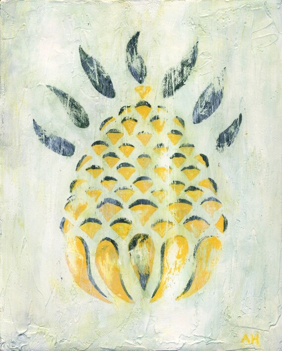
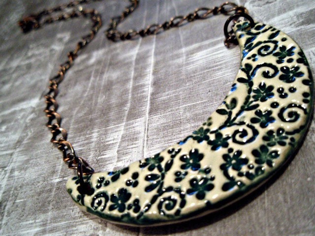
Autumn & Boo, an Etsy shop that provides unique, hand-painted wearable art, ornaments, & illustrations mainly for Autumn & Halloween, but also for other times of the year as well. I really like this shop. Their products look well made & original. Plus they’re oh so nice!

So, I will be critiquing Autumn & Boo’s shop announcement today because this is something we’ve not covered yet & it’s one of the first things customers see & read when they enter your shop.

Now to start off, I want to give you some things to keep in mind when it comes to shop announcements. If any of you follow my blog, then you’ve seen my blog series that’s going on right now called ReVAMPing Your Etsy Shop – 2011. This blog series is totally devoted to tackling each area of your shop & providing you with some great information to take with you so you can apply it. So below, I’m going to give you a crash course on what was covered in the post on shop announcements. If you want to learn more, then go check out the article on my blog!

There are 2 main purposes to your shop announcement.

1. SEO
2. Announcements

So let’s look into SEO first.

SEO or search engine optimization is how search engines rank your shop in search results among similar listings. Search engines take your shop announcement, analyze it, & rank it according to content & popularity among similar sites.

Did you hear me? I said they take all of your writing & use it to rank you. So if you only talk about an upcoming sale in your shop announcement then that’s not going to rank too well. It will probably end up way down the list near the bottom.

The reason is you’re not using consistent keywords that people use when they’re searching on search engines. You’re not talking enough about what you offer in your shop. People don’t normally search for “sale” & that’s it. They’d get a gazillion search results for the word “sale”. Most people use specific searches. Maybe something like “crocheted baby blanket sale” would be better. If you use that keyword phrase several times in your announcement, then at least you’d have more of a chance than with “sale” only.

Now you can go to any search engine, type in the name of your shop, & start looking for it in the results to see what it says. In fact, you should do that. Your listing will only show the first 140 or so characters. You’d better make them good & relevant because you’re trying to get people to click on your shop & come visit it. You want them to know what you offer, right? SEO is a real deal & if you want more views in your shop, it’s something you need to learn & pay attention to.

Next up is the announcement part.

Like I said earlier, the first 140 characters are used for SEO purposes, so fill that space up with keywords about what you offer in your shop.

The rest of the space is you’re to do what you wish with. You can talk about how you make what you make, you can talk about a current or upcoming sale, or you can direct readers to important parts of your shop like your policies or your profile. {Pssst…those links also help up your ranking on search engines too!} It’s totally up to you. As with any writing, you need to make it clear & easy to understand, format it so it’s easy to read & skim through, & check for spelling or grammatical errors. Remember to use your keywords consistently throughout your announcement so the search engines will rank you higher for those searches. SEO IS IMPORTANT!

Okay, enough with the info, let’s look at Autumn & Boo’s announcement & see what’s going on.

Here it is in the shop:


My first thought is that there aren’t enough specific keywords used throughout this entire announcement.

My second thought is that some of the information in this announcement should be somewhere else, not in the announcement. For example…the part about commissions & viewing more of her work should be in her profile bio. The payment part should be in her policies. The teams she’s apart of can be listed on her profile page if she chooses.

So, here’s an example of how I’d write this announcement if this super cute shop were mine.

Welcome to Autumn & Boo! Here you will find Autumn & Halloween inspired handmade jewelry such as cameos, broaches, pins, & pendants as well as Halloween ornaments & Halloween illustrations.

My handmade jewelry is hand-sculpted & hand-painted as are my Halloween ornaments. My Halloween illustrations are done by hand using archival quality ink, watercolor, & colored pencils. 

Any item can be custom designed to fit your needs. See my Alchemy settings here. {link}

For more information about me & my shop, see my profile {link} & my shop policies {link}.

Thank you for stopping by!

This would be my main announcement that I’d use all the time. If I decided to have a shop sale, I’d add something about that into this. If I added a new section or some other holiday items I’d talk about that briefly as well, directing customers right to that section via a link.

Here it is in a Google search:

Actually, I couldn’t find her main shop in a Google search. I searched for “autumn and boo” which brought up her blog, but no etsy shop. Then I searched the way she writes her name in her shop, “autumnandboo” & I found it, but there wasn’t a main listing – only a profile listing, sold items listing, & policy listing.

So, it looks to me that some SEO work needs to be done, & she needs to separate the words in her shop name. I think this would seriously help because she has a unique name which is easy to remember & should rank well in searches.

Final Thoughts…

All in all, I’m loving this shop! It has great products & such potential. The target market is a small one, but if you know where they’re at, you can go get ‘em! I’d seriously work on that SEO so some of your work can be done by search engines, I’d keep listing new items, I’d branch out with more product lines & I’m market my tush off! Good luck Autumn & Boo!!

Meagan
Visit me at my Etsy shop: Baby Swank or at my blog: MeaganVisser.com

Saturday, March 12, 2011

Mini Critique: Easy Tips for Writing Your Payment Policy

Dollar Sign Necklace by Trophies on Etsy


Today’s critique is for Shades of Grey, & I’ll be focusing on her payment policy.

But before I begin her critique, as always, I want to give you some points to remember when it comes to writing your payment policies.

4 Things to Keep in Mind when Writing Your Payment Policy?

  1. Your payment policy is where you’re going to let you customer know what forms of payment your accept. On Etsy you can choose to be paid by PayPal, personal check, & money order. You need to talk about each form of payment you accept individually. Be specific & let your customer know how each type of payment works. You never know if they’re a first time buyer. Don’t overlook the fact that they might not know anything about the checkout process. You can even include a link to this checkout how-to for customers. How to Shop on Etsy
  2. Let the customer know when you expect payment. Give them a time frame & tell them if the payment needs to clear before you ship.
  3. It’s also a good idea to include your policy on canceling transactions here. The seller has to be the one to cancel the transaction so you need to let customers know that if they want to cancel their order that they need to do it within a certain amount of time {if you wish} & they need to contact you so you can cancel it & refund their money. Etsy has now updated their policy on canceled transactions. If you have to cancel a transaction, Etsy will credit back the .20 listing fee & the 3.5% transaction fee to your bill.
  4. Keep it simple. You want your customers to read your policies so they know what to expect & so they’ll feel comfortable purchasing from you. Don’t make your policies overly wordy. Check for spelling & grammatical errors. Use paragraphs, short sentences, & make sure your writing makes sense.

Now let’s take a look at each payment method below.

PayPal

PayPal is probably the easiest way for customers to pay you. PayPal is free & it’s easy to set up an account with them. They accept all major credit & debit card & you can pay from your checking account through PayPal. Customers do not have to have a PayPal account to use PayPal when purchasing from you. These are all things to include in your Payment Policy under “PayPal”.

For more help with using PayPal in your Etsy shop, check out the following link: PayPal Workshop

Personal Check

Choosing whether or not to accept customer checks is a personal decision. Some sellers do & others don’t. Like I said earlier, if you want to give your customer the option of paying with a check you can always use PayPal. They enter their checking account information into PayPal & PayPal gets you your money.
If you decide to take checks yourself, it’s a good idea to let the customer know up front that their purchase will not ship until their check clears. That keeps you from getting swindled incase their check bounces leaving you with no cash & no product, & it lets them know what to expect as far as timing goes.

Money Orders

It seems that accepting money orders can be as sticky of a situation as accepting checks. From what I’ve read on the topic, most Etsy sellers say to only accept certified USPS {post office} money orders because others could be scams. Again, if you choose to go this route, make sure you let your customer know that you will not ship their purchase until the money order clears. Don’t worry about offending them…they more than likely will understand your position.

Okay, so now onto the critique!

Alright, so here's Shades of Grey's Payment Policy.

Payment Policy - I accept PayPal payments. Please complete your payment within 24 hours of purchase. Production will not begin until payment is received.
So, IMO, this policy doesn't provide enough information.You can never assume a customer knows how things work or what they're supposed to do. It doesn't hurt to give details. If they know what you're talking about, they'll skim over that part.

Now, the form of payment is listed, but maybe telling your customer a bit more about PayPal, how it works, & what to expect would be nice. 

I do like that you give a time frame on when you expect to receive payment by. 

I'd include your cancellation policy, & provide a link to the How-to Shop on Etsy tutorial.

That's it! A simple, easy, quick fix that will give you a great payment policy that your customers will be clear on! Till next time...good luck!

Meagan Visser is a wife, mother, & creative entrepreneur. Her passion is her family & helping moms learn to build successful creative businesses without neglecting their families. You can connect with her on her website MeaganVisser.com, at her Etsy shop Baby Swank, or on Facebook & Twitter.

Saturday, March 5, 2011

What Impression is Your Shop Leaving your Customers?


I'm Impressed by Jake & Noel on Etsy


Today's mini critique is for SilverSmack, and she wants to know what the overall impression is of her shop.

So since this is a little different than a normal critique, here's what I'm going to do. I'm going to show you a screenshot of SilverSmack's shop, give my two cents on the impression that her shop gives me, and then leave you with a check list to use on your own shop so you can see what kind of impression you're leaving for your customers.

Okay, so lets get going. Here's SilverSmack's shop.

~*~*~*~*~*~*~*~*~*~*~*~*~*~*~*~*~*~*~*~*~*~*~*~*~*~
Here's what I see:
  • pics - sell silver jewelry that's hammered & worn {not polished}
  • prices - midrange & affordable
  • listings - You're a serious shop. You have a business. You're a professional not hobbiest. I can see this because you have a lot of listings, you list frequently, & you have regular sells.
  • sections - you offer a variety of jewelry
My thoughts on your shop:
  • title - it says "inspiration"...I'd change that to "jewelry" because when that shows up in a Google Search, people won't know what you make from the word inspiration
  • banner - you only have pics of your rings. Since you make other pieces of jewelry too, I'd add a pic of a necklace & earrings as well as a ring.
  • listing photos - look nice. Nice backgrounds & props...in some photos, the colors of the jewelry are competing with the color of your background {gray on gray or white on white}.
  • descriptions - great use of links. I did notice that in some you weren't providing a link to your policies even though you were directing customers to them.
  • SEO - looks like you've done well getting your shop optimized for SEO from the look of keywords used in your listing titles, descriptions, & shop announcement
My thoughts as a customer:
  • return/exchange policy - I was excited to see that you offered lifetime repair on your jewelry! That makes me very comfortable buying from you!
  • description links - like I said earlier...provide a link for me if you're directing me somewhere. Make it as easy as can be for me.
  • description questions - Why do I need to order my ring a half size bigger than I wear? What does "oxidized" mean? It would be a good idea to answer any & every question a buyer may have. 
  • Profile bio or welcome - tell me about your crafting process. This helps me to value the product I may buy from you more. It also helps me to understand the price as well.
Overall impression:
 Great shop! Nice products! I feel like I know exactly what I'm getting from you & what to expect. I know that if I have any trouble or change my mind that you will work with me to meet my needs. I also like the fact that I can get anything custom made from you!


    ~*~*~*~*~*~*~*~*~*~*~*~*~*~*~*~*~*~*~*~*~*~*~*~*~*~

    7 Ways to Leave a Good Impression with Your Shop
    1. Graphics & Pictures - high resolution, not grainy, styled & branded well, professional looking
    2. Copy - well written, no grammatical or spelling errors, provide all necessary info about product, answer any potential questions customer may have
    3. Bio - tell about yourself & how you got started in your craft & your shop, provide links to important places in your shop & on the web.
    4. Customer Service - appear friendly & easy going in your writing, tell how to contact you, let buyers know if you offer custom orders, make return/exchange policy clear
    5. Policies - well written, provide all necessary information, be specific
    6. Feedback - work to satisfy customers so you'll get great feedback. Good feedback makes customers feel comfortable buying from you
    7. Pricing - offer a range of prices so there's something for everyone


    What do you do in your shop to provide customers with a "good impression"?


    Saturday, February 26, 2011

    How to tell if your business is "branded".
    Branding Irons by Monki Vintage on Etsy

    Today's mini critique is for Flourish & Debonair. I just love that name! It's so...ritzy! Anyway, she'd like to know about the branding & cohesiveness of her shop.

    Well, if you are serious about your business than it needs to be branded. If you want an in-depth look at branding, read the article Branding 101 that I wrote for Handmadeology. But, if you're looking for a quick way to learn how to brand your biz, then here are 5 things you need to do to create a brand for your business.
    1. Come up with a mission statement. What is your business all about?
    2. Describe your products. Key features & characteristics. What sets you apart from the competition?
    3. Describe your target market. Who are your products for?
    4. Evaluate your Business or Product Name. Does your name reflect your mission statement?
    5. Come up with a tagline. Does it reinforce your mission statement?

    As far as cohesiveness goes. If you've branded your business & it's reflected in every aspect of your shop...it will automatically bring cohesiveness.

    Now let's check out Flourish & Debonair's shop & see what it looks like!

    ~*~*~*~*~*~*~*~*~*~*~*~*~*~*~*~*~*~*~*~*~*~*~*~*~*~


    What she's doin' right...

    • Let's start with the name...which again, I love! Flourish means showy, and Debonair means sophisticated. So, those are two HUGE keywords right there. Use them EVERYWHERE! They need to be in your marketing, in your descriptions, and mainly in the items you choose and make for your shop. Look at each individual item. Is it showy? Is it sophisticated? If not, get rid of it. It doesn't fit your brand.
    • Graphics - love, love, love your banner colors. The grey and yellow look great together. They reflect showy & sophisticated. & I love that you're using two fonts in your banner that reflect the meanings of the words.
    • Ideal - to me, your shops purpose or mission seems to be to provide style for men & women by using a mixture of vintage & modern clothing & accessories. This needs to be reflected in all your marketing. Even in your product descriptions. Tell a story through your descriptions. I love this one...http://www.etsy.com/listing/56953209/vintage-handbag-cream-faux-crocodile. The first paragraph is great. Try to do this with every listing. Keep that showy, sophisticated, vintage yet modern theme going strong.
    • I think your shop looks very cohesive. The jewelry works well with the vintage especially since you're using vintage materials to make the jewelry.


    What I think could use some improvement...
    • Graphics - I'm a big fan of matching avatars & banners. If you have a logo made for your business, that's what people start to recognize your business as. Calvin Klein is recognized by "CK" not a picture of his jeans. I'd come up with an avatar that matches your banner. You could use the grey & yellow and put a F&D on it or something. Very nice! Remember to use this for the product tags & business cards too!
    • Links - One way to blend your jewelry into your vintage is to match some of the jewelry listings up to some clothing listings. Link them to each other in your descriptions. Say something like, these earrings would look great with this dress, or this tie coordinates with this jacket.

    ~*~*~*~*~*~*~*~*~*~*~*~*~*~*~*~*~*~*~*~*~*~*~*~*~*~

    Leave us a comment below & share the ways you've branded your business.


    "Hope you enjoyed it!" - Meagan @BabySwank & @MeaganVisser.com

    Saturday, February 19, 2011

    How to Become "Customer Friendly"

    Today's mini critique is for Designs By Swish & she'd like to know how to make her shop more "customer friendly".

    So you've heard the term "User Friendly" & you know that means that something is easy & simple to use or to navigate through. This term usually refers to products & software, but today I'm going to share with you 4 ways to make your Etsy Shop "Customer Friendly".

    They are:
    1. Welcome Message - welcome customers & let them know what kind of products you offer
    2. Sections - categorize your products to make them easier to find
    3. Links - link to key pages in your shop {bio, policies, alchemy settings, etc.}
    4. Bio - link to bestselling section, contact info, & shop policies
    Not many people are going to take the time to search through your shop to find things. If they don't see what they're looking for in the first 30 seconds or your shop looks cluttered & difficult to search through, they'll move on to another shop. To learn more about these 4 areas in detail check out my latest post...Is Your Shop "Customer Friendly"?

    Now let's check out Designs By Swish's shop & see how "customer friendly" it is!

    ~*~*~*~*~*~*~*~*~*~*~*~*~*~*~*~*~*~*~*~*~*~*~*~*~*~*~*~*~*~*~*~*~*~*~*~*~*~*~

    Here we see the above areas in Swish's shop.
    • Shop Announcement and Policy Welcome
    • Bio
    • Shop Sections


    What she's doin' right...
    • Shop Announcement - keywords & Valentines day announcement
    • Bio - tells about herself & her passion
    • Sections - her products are categorized

    What I think could use some improvement...
    • Shop Announcement - keywords are too broad. There's a lot of competition out there for "handmade jewelry", "necklaces", & "bracelets". Go over your shop's SEO. It's a good idea to do this periodically.
    • Policy Welcome - I'd tell more about the products you offer here. Is your jewelry for everyday wear, weddings, special occasions, or all of the above? How do you make it? I'd move your custom order bit to the "Additional Info" section & link to your alchemy settings so customers can see exactly how custom orders work in your shop. I'd move your packaging tidbit to the "Shipping" section.
    • Bio - I'd work on engaging readers with your bio. Check out these two articles... Provide links to your convo page or email address, your policy page, & your shops main page. It's also a good idea to link to your feedback here as well. For more about bios, check the last mini critique out: What Buyers Are Learning From Your Profile Page, and also this article on profile bios: ReVAMPing Your Etsy Shop - 2011: Profile Bios.

    ~*~*~*~*~*~*~*~*~*~*~*~*~*~*~*~*~*~*~*~*~*~*~*~*~*~*~*~*~*~*~*~*~*~*~*~*~*~*~

    Leave us a comment below & share the ways you've improved your shop to be more "customer friendly"!


    "Hope you enjoyed it!" - Meagan @BabySwank & @MeaganVisser.com